Website Design: Big Sky Bread Company
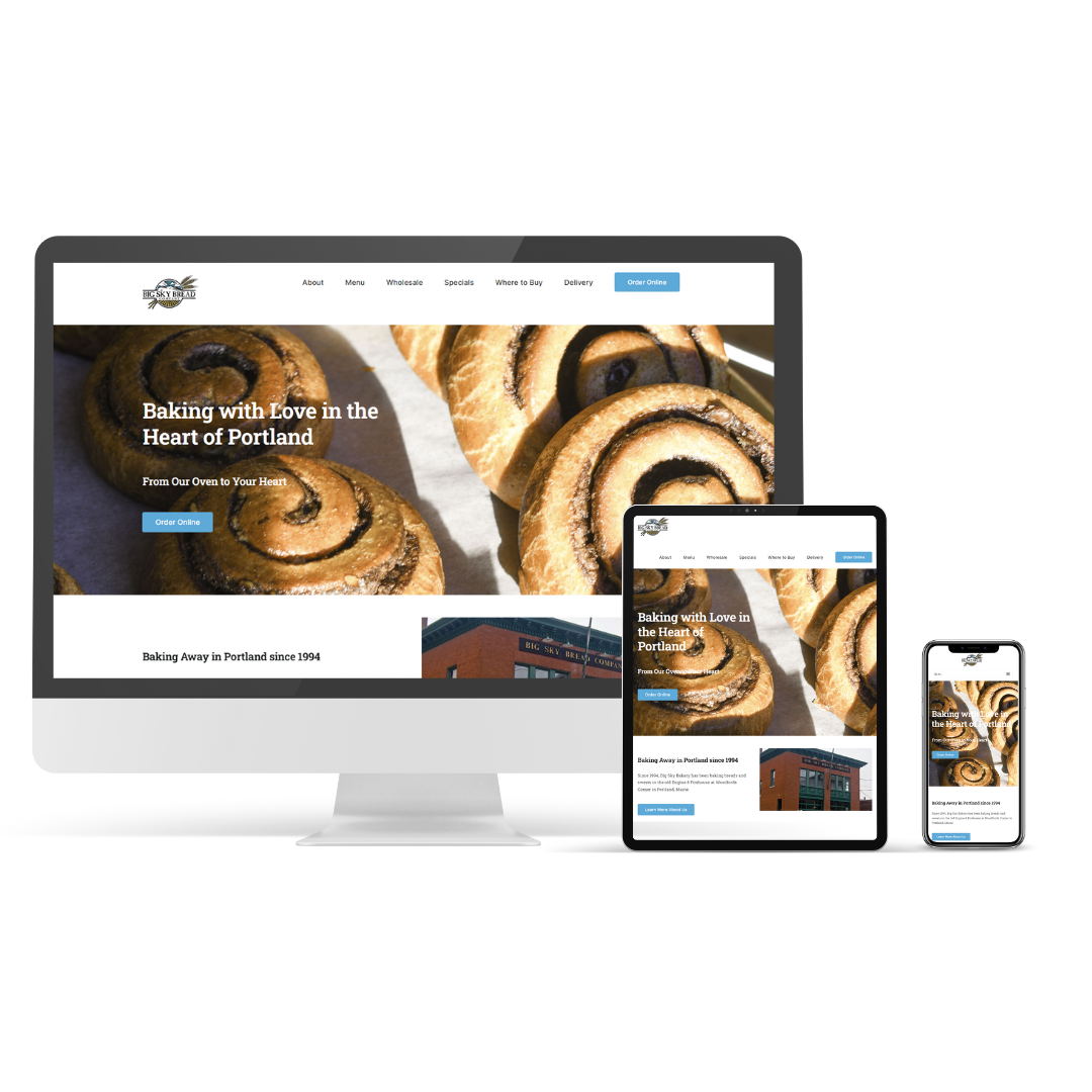
I’m excited to share the latest project I’ve been working on: a complete website makeover for Big Sky Bread Company. Their site, almost a decade old, was in need of a refresh, and I was thrilled to take on the challenge.

My main focus was to ensure that the new website not only looks great but also performs exceptionally on all devices. I’m proud to say it’s now fully mobile-friendly, so customers can enjoy browsing and shopping for their favorite artisanal breads anytime, anywhere.
SEO optimization was key in this redesign. I wanted to make sure that when people search for delicious, wholesome breads, Big Sky Bread Company pops right up. Through strategic design and content updates, the site is now primed for better search engine visibility.
The new website sports a clean, modern look that mirrors the quality and care Big Sky Bread Company puts into every loaf. It’s easier than ever for customers to navigate, learn about their unique offerings, and make purchases with just a few clicks.
I’m super excited about this launch and can’t wait for everyone to check out the revamped Big Sky Bread Company website. Here’s to fresh starts and even fresher bread!

